Comparison of 3 Strathmore Visual Journals
I decided to do a direct comparison of the 3 Strathmore Visual Journals by doing a sketch in pencil, then ink, and finally reasonably wet watercolor painting. See my previous post for information about why I am using these instead of my usual daily handbound watercolor journals. I will tag each of these entries in the "Strathmore" category on the right sidebar.
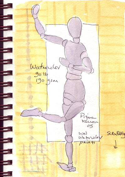
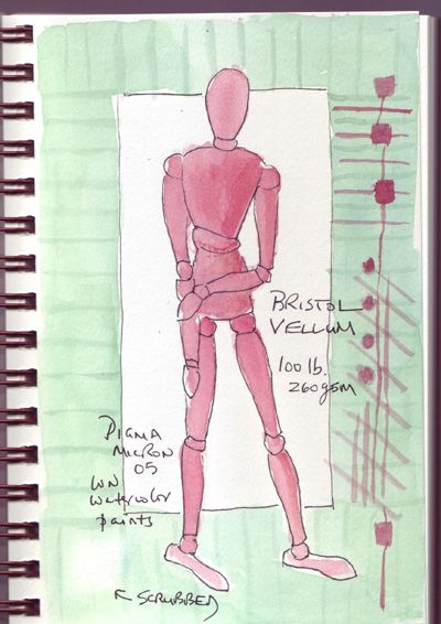
Here are the current 3 pages for comparison - all drawings were done at the same time, then ink was added to all at the same time, and then they were painted. I painted the figures, going down the line. After they dried, I painted all of the borders. After they dried, I tried glazing with the complementary color and scrubbing with a stiff brush. In reality I probably only waited 5-10 minutes between painting the layers.
Watercolor:
Bristol Vellum:
Mixed Media:
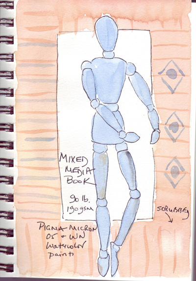
Conclusion: The different paper types were more similar than different in this direct comparison with pen, ink, and watercolors. Each of the pages buckled a little as it dried, but as soon as they were dry, I scanned them (not more than 1 hour later) and there were no shadows from the buckling. And this morning, the pages are flatter. The glazing looked similar on each, and I was able to lift a little paint from each page with a stiff brush, and with only a little roughing up of the paper. I like to use both sides of my 140 lb watercolor paper, so next I need to test these pages further by painting on the other side.
I've worked on a few other pages in each journal and after I've done a few more, I'll post the results for a single journal, one by one, showing the various ways I tested my tools in that journal.
Comments
That's a very nice study =) I get lost most of the time when it comes to which paper to use and all since I love using both dry and wet media
Posted by: Alex Tan | October 20, 2010 10:36 AM
Interesting, looking forward to seeing what happens with the other side.
Posted by: Cathy | October 21, 2010 2:25 AM